CSS (Cascading Style Sheets) 层叠样式表
- 选择器: 选择HTML元素的方式, 可以使用标签名, class属性值, id值等多种方式
- 样式声明: 用于给HTML元素设置具体的样式. 格式是属性名: 属性值.
选择器{
    属性名: 属性值;
    属性名: 属性值;
    属性名: 属性值;
}
h1{
    color: red;
    font-size: 5px;
}
入门案例
<!DOCTYPE html>
<html lang="en">
<head>
    <meta charset="UTF-8">
    <title>入门案例</title>
    <style>
        h1{
            font-size: 100px;
            color: red;
        }
    </style>
</head>
<body>
<h1 >今天开始爱学习!</h1>
</body>
</html>
CSS 的引用方式
* 内联样式
    在标签中通过style属性来控制样式, 只能影响当前这一行
    格式 <标签 style="属性名:属性值; 属性名:属性值;">内容</标签>
* 内部样式
    在<head>标签中通过<style>标签来控制样式, 只能影响当前文件
    格式<head><style> 选择器{ 属性名:属性值; }</style></head>
* 外部样式
    在<head>标签中通过<link>标签来引入独立css文件, 可以影响不同的文件
    格式<link rel="stylesheet" href="sample.css"> 相对路径css文件或网络css文件都可
- CSS 的注释
/* 注释内容 */
- CSS 选择器分类
- 基本选择器
元素选择器 标签名 根据标签名匹配元素      div{}
类选择器   .      根据class属性值匹配元素 .center{}
id选择器   #      根据id属性值匹配元素    #username{}
- CSS 选择器分类
- 属性选择器
属性选择器 [] 根据指定属性匹配元素 [type]{}[type=text]{}
- CSS 选择器分类
- 伪类选择器
标签名:link    未访问的状态   a:link{}
标签名:visited 已访问的状态   a:visited{}
标签名:hover   鼠标悬浮的状态 a:hover{}
标签名:active  已选中的状态   a:active{}
<!DOCTYPE html>
<html lang="en">
<head>
    <meta charset="UTF-8">
    <title>CSS伪类选择器</title>
    <style>
        a:link{
            color: black;
            text-decoration: none;
        }
        a:visited{
            color: blue;
            text-decoration: none;
        }
        a:hover{
            color: red;
            text-decoration: none;
            font-weight: bold;
        }
        a:active{
            color: yellow;
        }
    </style>
</head>
<body>

<a href="01-入门案例.html" >入门案例</a>
</body>
</html>
- CSS 选择器分类
- 组合选择器
后代选择器 空格 使用空格结合多个选择器,基于第一个选择器,匹配第二2选择的所有元素 .center li{}
分组选择器 ,    可能同时匹配多个元素                div,span,p{}
<!DOCTYPE html>
<html lang="en">
<head>
    <meta charset="UTF-8">
    <title>CSS组合选择器(后台选择器和分组选择器)</title>
    <style>
        .center li{
            color: red;
        }
        div,span,p{
            color: green;
            font-size: 30px;
        }
    </style>
</head>
<body>
<div>asf</div>
<a><span>asdf</span></a>
<p>asdf</p>
<ol class="center" >
    <li>列表</li>
    <li>列表</li>
</ol>
</body>
</html>
边框样式 border
border        设置所有边框
border-top    设置上边框
border-left   设置左边框
border-right  设置右边框
border-bottom 设置下边框
border-radius 设置边框弧度

solid         实线
double        双实线
dotted        圆点
dashed        虚线
文本样式
color           文本颜色     颜色单词(red),RGB(#000000)
font-family     字体         微信雅黑,宋体
font-size       字体大小     像素点20px
text-decoration 文字下划线   none无underline下划线overline上划线line-through
text-align      水平对齐方式 left居左right居右center居中
line-height     行间距       像素点20px
vertical-algn   垂直对齐方式 top居上bottom居下middle居中(还可百分比调节)
<!DOCTYPE html>
<html lang="en">
<head>
<meta charset="UTF-8">
<title>新闻头条</title>
<link rel="stylesheet" href="news.css">
</head>
<body>
<div class="divTop">
<a href="#" class="divTopA">登录 </a>
<a href="#" class="divTopA">注册 </a>
<a href="#" class="divTopA">更多 </a>
</div>
<div class="divNav">
<img src="background.png" width="100px" height="40px">
<a href="#">首页</a><span> /</span>
<a href="#">科技</a><span> /</span>
<font color="gray">正文</font>
</div >
<div>
<hr/>
</div>
<div class="divContend">
<div class="divLeft">
<div>
<a href="#"><img src="test.png"><span> 评论</span></a>
</div>
<hr/>
<div>
<a href="#"><img src="test.png"><span> 评论</span></a>
</div>
<div>
<a href="#"><img src="test.png"><span> 评论</span></a>
</div>
<div>
<a href="#"><img src="test.png"><span> 评论</span></a>
</div>
</div>
<div class="divCenter">
<p>弹性布局flex是一个几年前的CSS属性了,说它解放了一部分生产力不为过。至少解放了不少CSS布局相关的面试题 :)
之前网上流行的各种XX布局,什么postion: absolute+margin,float+padding,各种都可以使用flex来取代之。
早两年在使用的时候,还是会担心有兼容性问题的,某些手机在使用了auto-prefixer以后依然会出现不兼容的问题。
好在现在已经是2018年了,不必再担心那些老旧的设备,希望这篇文章能帮你加深对flex的认识。
</p>
<p>
首先,flex被称为一个弹性盒模型,也有称弹性布局的。
总之,盒子也好、布局也罢,我们总是需要有一个容器Container的:
</p>
<ol>
<li>首先,flex被称为一个弹性盒模型,也有称弹性布局的。kskdfjksjdfk</li>
<li>总之,盒子也好、布局也罢,我们总是需要有一个容器Container的</li>
</ol>
<img src="background.png" width="100%">
<p><strong>加粗1</strong>弹性布局flex是一个几年前的CSS属性了,说它解放了一部分生产力不为过。至少解放了不少CSS布局相关的面试题 :)
之前网上流行的各种XX布局,什么postion: absolute+margin,float+padding,各种都可以使用flex来取代之。
早两年在使用的时候,还是会担心有兼容性问题的,某些手机在使用了auto-prefixer以后依然会出现不兼容的问题。
好在现在已经是2018年了,不必再担心那些老旧的设备,希望这篇文章能帮你加深对flex的认识。
</p>
<p><strong>加粗2</strong>弹性布局flex是一个几年前的CSS属性了,说它解放了一部分生产力不为过。至少解放了不少CSS布局相关的面试题 :)
之前网上流行的各种XX布局,什么postion: absolute+margin,float+padding,各种都可以使用flex来取代之。
早两年在使用的时候,还是会担心有兼容性问题的,某些手机在使用了auto-prefixer以后依然会出现不兼容的问题。
好在现在已经是2018年了,不必再担心那些老旧的设备,希望这篇文章能帮你加深对flex的认识。
</p>
<img src="background.png" width="100%">
<p>
之前网上流行的各种XX布局,什么postion: absolute+margin,float+padding,各种都可以使用flex来取代之。
早两年在使用的时候,还是会担心有兼容性问题的,某些手机在使用了auto-prefixer以后依然会出现不兼容的问题。
好在现在已经是2018年了,不必再担心那些老旧的设备,希望这篇文章能帮你加深对flex的认识。
</p>
</div >
<div class="divRight">
<img src="test.png" width="100%">
<img src="background.png" width="100%">
<img src="test.png" width="100%">
<img src="background.png" width="100%">
</div>
</div>
<div class="divFooter">
<a href="#">内容</a>
<a href="#">内容</a>
<a href="#">内容</a>
<a href="#">内容</a>
</div>
</body>
</html>
.divTop{
    background: black;
    height: 50px;
    text-align: right;
    font-size: 25px;
}
.divTop a{
    color: white;
}

.divNav{
    height: 50px;
}

a{
    color: black;
    text-decoration: none;
    font-size: 25px;
}

a:hover{
    color: red;
}

.divContend{
    float: left;
}

.divLeft{
    width: 20%;
    float: left;
    text-align: center;
    vertical-align: 50%;
}

.divLeft img{
    width: 38px;
    height: 38px;
}
.divLeft span{
    vertical-align: 50%;
}

.divCenter{
    width: 60%;
    float: left;
}

.divRight{
    width: 20%;
    float: left;
}


.divFooter{
    clear: both;
    background: blue;
    text-align: center;
}
.divFooter a{
    color: white;
}

.divFooter a:hover{
    color: red;
}
表格标签
table  表格标签           width-宽度height-高度border-边框align-对齐方式
tr     行标签             align-对齐方式
td     单元格标签(列标签) rowspan-合并行colspan-合并列
th     表头标签(加粗和居中)
thread 表头语文标签
tbody  课外书语义标签
tfoot  表脚语义标签
<!DOCTYPE html>
<html lang="en">
<head>
    <meta charset="UTF-8">
    <title>表格标签演示</title>
</head>
<body>
<table width="500px" border="1px">
    <thead>
    <tr>
        <th>姓名</th>
        <th>性别</th>
        <th>年龄</th>
        <th>数学</th>
        <th>语文</th>
    </tr>
    </thead>
    <tbody>
    <tr align="center">
        <td>张三</td>
        <td rowspan="2">男</td>
        <td>20</td>
        <td colspan="2">90</td>
        <!--        <td>90</td>-->
    </tr>
    <tr align="center">
        <td>李四</td>
        <!--        <td>男</td>-->
        <td>21</td>
        <td>95</td>
        <td>90</td>
    </tr>
    </tbody>
    <tfoot>
    <tr align="center">
        <td>总分:</td>
        <td colspan="4">365</td>
    </tr>
    </tfoot>
</table>
</body>
</html>
CSS 样式控制
background-repeat 控制背景重复 no-repeat不重复,repeat-x水平重复,repeat-y垂直重复,repeat水平和垂直重复
outline 控制轮廓 double双实线,dotted圆点,dashed虚线,none无
display 控制元素 inline肉联元素(无换行,无长宽),block块级元素(有换行),inline-block肉联元素(有长宽),none隐藏元素
<!DOCTYPE html>
<html lang="en">
<head>
    <meta charset="UTF-8">
    <title>背景 轮廓 元素控制</title>
    <style>
        body{
            background: url("bg.png");
            /*background-repeat: no-repeat;*/
            /*background-repeat: repeat-x;*/
            /*background-repeat: repeat-y;*/
            background-repeat: repeat;
        }
        input{
            /*outline: none;*/
            /*outline: none;*/
            outline: double;
        }
        div{
            /*display: none;*/
            /*display: inline;*/
            display: inline-block;
            width: 50px;
        }
    </style>
</head>
<body>
姓名: <input type="text">
<br>
<div>春香</div>
<div>夏香</div>
<div>秋香</div>
<div>冬香</div>
</body>
</html>
CSS 灵魂, 盒子模型
- 盒子模型是通过设置边框和元素内容的边距, 从而实现布局的方式. 分为内边距和外边距两种方式
- 如果想实现布局, 可以采用设置内边距或外边距来实现.
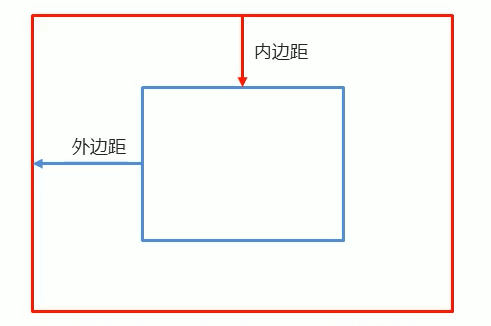
内外边距的设置, 取决于所在的视角. 一般常用是外边距. 内边距会导致盒子大小变化
margin-top    上外边距                             margin-top:50px;
margin-left   左外边距                             margin-left:50px;
margin-right  右外边距                             margin-rigth:50px;
margin-bottom 下外边距                             margin-bottom:50px;
margin        通用相同距离                         margin:50px;
margin        单独设置上右下左(从上开始顺时针)边距 margin: 50px 60px 70px 80px;
margin        自动计算外边距并水平居中             margin:auto


padding-top    上外边距                             padding-top:50px;
padding-left   左外边距                             padding-left:50px;
padding-right  右外边距                             padding-rigth:50px;
padding-bottom 下外边距                             padding-bottom:50px;
padding        通用相同距离                         padding:50px;
padding        单独设置上右下左(从上开始顺时针)边距 padding: 50px 60px 70px 80px;
padding        自动计算外边距并水平居中             padding:auto
<!DOCTYPE html>
<html lang="en">
<head>
<meta charset="UTF-8">
<title>登录页面</title>
<link rel="stylesheet" href="login.css">
</head>
<body>
<div>
<div>
<img src="bg.png" >
</div>
<div class="center">
<form action="#" method="get" autocomplete="off">
<table width="100%">
<thead>
<tr>
<th colspan="2">账 号 登 录 <hr/></th>
</tr>
</thead>
<tbody>
<tr>
<td> <label for="username">账 号 </label> </td>
<td><input type="text" name="username" id="username" placeholder="请输入账号" required></td>
</tr>
<tr>
<td><label for="password">密 码 </label></td>
<td><input type="password" name="password" id="password" placeholder="请输入密码" required></td>
</tr>
</tbody>
<tfoot>
<tr>
<td colspan="2"><button type="submit">确定</button> </td>
</tr>
</tfoot>
</table>
</form>
</div>
<div class="footer">
<br/>
<br/>
登录/注册即表示您同意
<a href="#" target="_blank">用户协议</a>
和
<a href="#" target="_blank">隐私条款</a>
<a href="#" target="_blank">忘记密码</a>
</div>
</div>
</body>
</html>
body{
    background: url("bg2.png");
    background-repeat: no-repeat;
}
.center{
    background: white;
    width: 40%;
    margin: auto;
    margin-top: 100px;
    text-align: center;
    border-radius: 15px;
}
table th{
    color: orangered;
    font-size: 30px;
}

table label{
    font-size: 20px;
}

table input{
    outline: none;
    border-radius: 5px;
    border: 1px solid gray;
    width: 90%;
    height: 40px;
}

table tr{
    line-height: 80px;
}

tfoot button{
    border: 1px solid crimson;
    height: 40px;
    width: 95%;
    border-radius: 5px;
    background: crimson;
    color: white;
    font-size: 20px;
}

.footer{
    width: 35%;
    /*color: gray;*/
    margin: auto;
    font-size: 18px;
}
a{
    font-size: 18px;
    text-decoration: none;

}
Nginx 安装
上传则可用scp就可
# 账号密码上传
scp -r folder -P 22 [email protected]:

# ssh key上传
scp -r folder -P 22 mineFuWuQi: